Comparison Slider for figures and images with RICV
By Kailas Venkitasubramanian in R
February 17, 2022
There is no end to all the magic you can do with R. I come across at least one nifty tool in the web everyday. RICV is one such awesome little visualization package that lets you compare plots using sliders.
Here’s a short introduction of RICV’s magic.
Get set up
Install the package from github and call the libraries you need to create visualizations. ggplot is my viz workhorse. I also call ggthemr because it lets me use the rust theme whose color palettes work nicely with this website theme :).
# devtools::install_github("xvrdm/ricv")
library(dplyr)
library(ggplot2)
library(ricv)
library(ggthemr)
Invoke the theme
Let’s get the rust theme
ggthemr('dust')
Generate a few plots
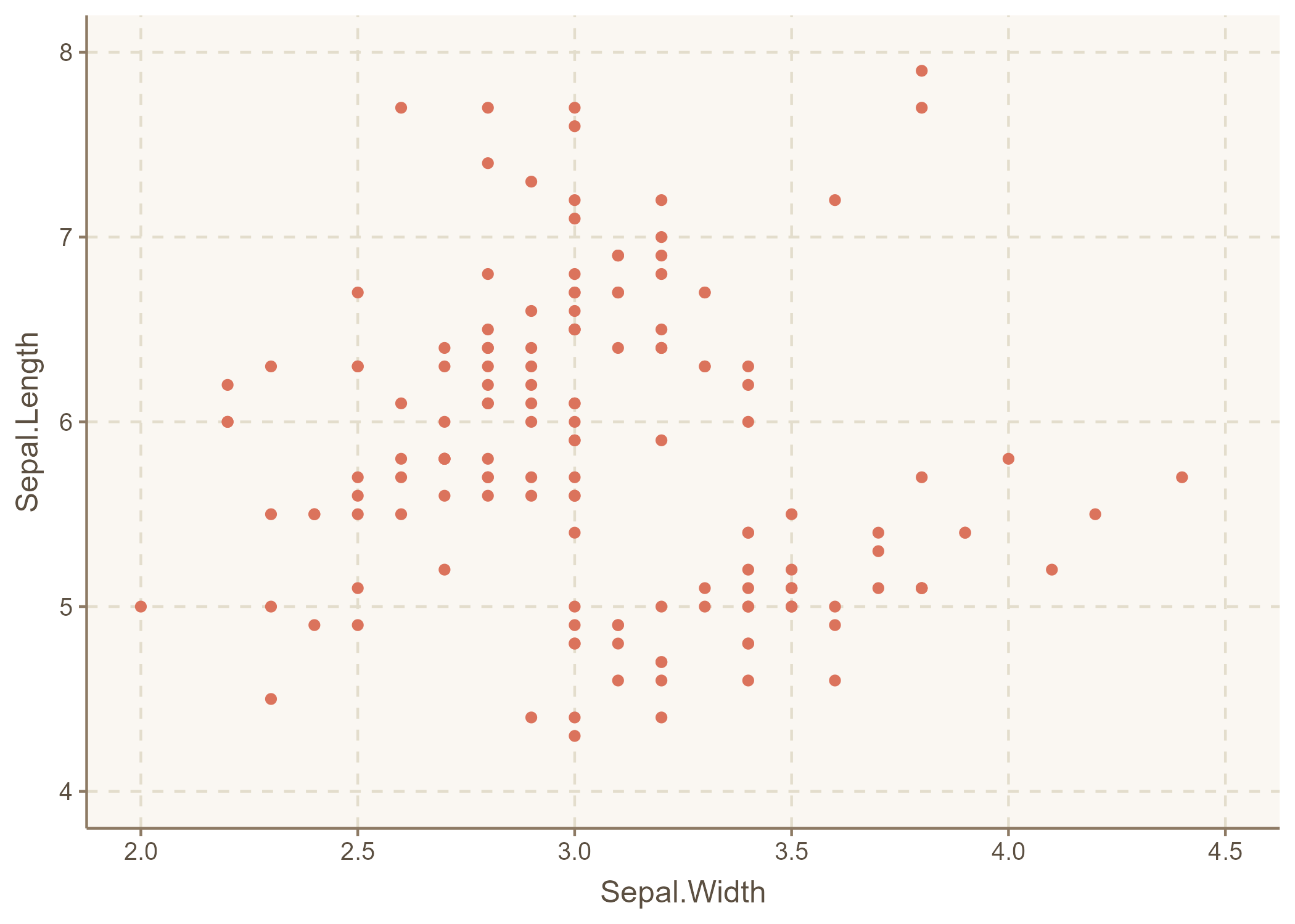
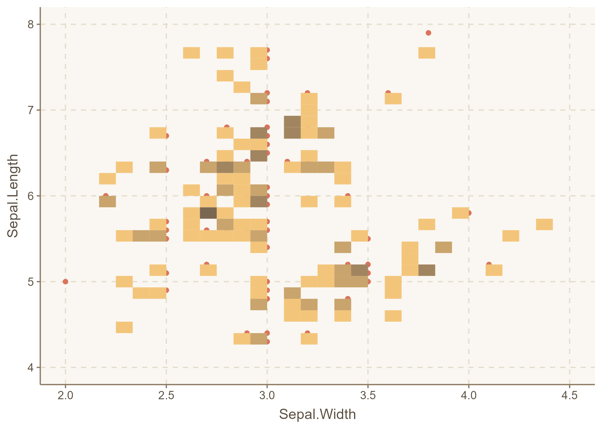
I got the IRIS dataset to test a few bivariate scatterplot variants. p1 is a basic plot. p2 is a bin2d plot where the rectangle shading usually helps when there is overplotting.
plot_gg <-  ggplot(data=iris, aes(x=Sepal.Width,y=Sepal.Length)) +
  geom_point() +   xlim(2, 4.5) + ylim(4, 8)

p1 = tempfile(fileext = '.png') %>%
                basename() %>%
                  paste0('img/', .)

p2 = tempfile(fileext = '.png') %>%
                basename() %>%
                  paste0('img/', .)

ggsave(p1,plot_gg)

ggsave(p2,plot_gg +
         geom_bin2d()+theme(legend.position = "none"))
Check the plots
They look right. Now let’s combine them!
Combine plots and bring the slider
ppp <- ricv(img1 = p1, img2 = p2,
     options = list(addCircle = TRUE, hoverStart = TRUE))

ppp
## $addCircle
## [1] TRUE
##
## $hoverStart
## [1] TRUE
##
## NULL
## $addCircle
## [1] TRUE
##
## $hoverStart
## [1] TRUE
##
## attr(,"class")
## [1] "Options"
We now have the plots overlaid and a slider lets us interact and visualize changes or get a different visual perspective of the bivariate relationship.
Generate a regression overlay
Let’s try a variant that is especially useful - regression lines that can be overlaid and swept away on demand when exploring scatterplot. p3 creates a smooth regression line with confidence intervals.
p3 = tempfile(fileext = '.png') %>%
                basename() %>%
                  paste0('img/', .)

ggsave(p3,plot_gg +
         geom_smooth())
Awesomeness
We now can slide regression lines in and out of plots.
ppp1 <- ricv(img1 = p1, img2 = p3,
     options = list(addCircle = TRUE, hoverStart = TRUE))
## $addCircle
## [1] TRUE
##
## $hoverStart
## [1] TRUE
##
## NULL
## $addCircle
## [1] TRUE
##
## $hoverStart
## [1] TRUE
##
## attr(,"class")
## [1] "Options"
ppp1
Many possibilities
That’s it, folks. Try out RICV to add a bit of literal slickness to your visualizations. I’ll try to use this utility when showing changes over time, compare model estimates, or display maps with different filters.